From React to Qt
We initially built the interface in React, then moved to C++ and Qt to meet the course’s requirement for at least 60% C++. Qt was also a practical fit for a native desktop application: its widgets gave us a consistent application shell, Qt Charts handled the time-series view, and background work could run without freezing the interface. The change was larger than a visual port because every screen had to be reconnected to the team’s Python and C++ services.
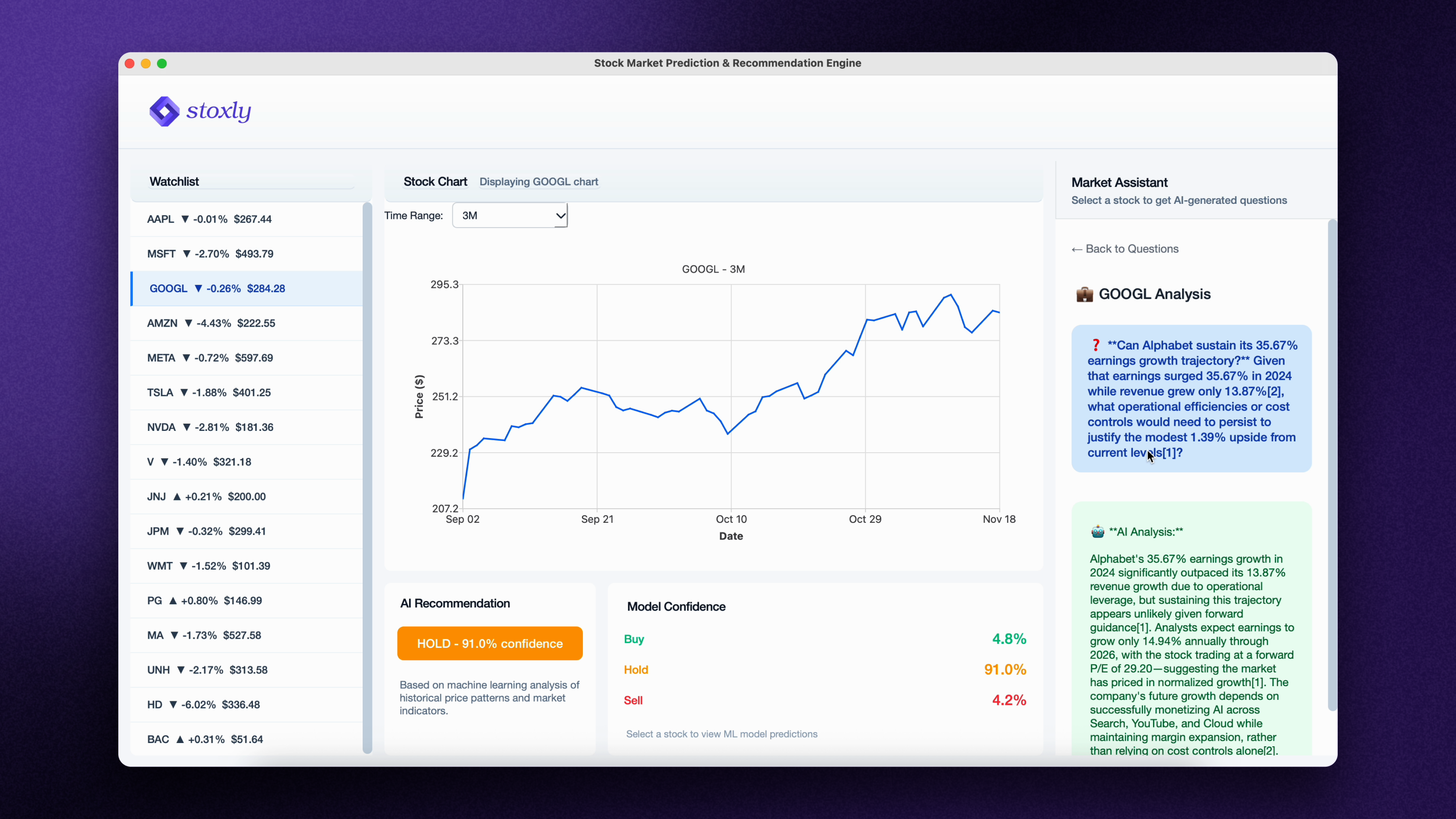
The information hierarchy was informed by familiar investing tools such as Wealthsimple and Questrade. The watchlist stays on the left for repeated navigation, the selected stock’s chart occupies the largest area, and the market assistant stays visible on the right. Recommendations and all three confidence scores sit below the chart, so the result remains connected to the price history that produced it.
Getting data into the interface
A large part of the integration work was getting Python’s data pipeline and the C++ interface to agree on how data would move between them. Lucas and I connected the database and Python functions to the Qt frontend, refactoring parts of the ingestion code into standalone modules that the application’s control objects could run. That kept data collection outside the view code and made the dashboard responsible for presentation and interaction rather than preprocessing.
The pipeline collects a year of daily market data with yfinance, cleans it with Pandas, and stores it locally in SQLite. We chose SQLite because the dataset fit a local desktop application, queries were fast, and it avoided operating a separate database server. Journal mode was part of the design so an interrupted write would not leave the interface reading a partial update.
External API calls were the slow part of the path. Threading the ingestion calls reduced the measured load from 1.11 seconds to 0.63 seconds in our design tests. After the data is stored, selecting a stock retrieves its complete history once; changing from one month to three months slices that result in memory instead of making another network request or database query. This is why the chart range can change without rebuilding the entire data path.
Separating the system into services
The design document divides Stoxly into four subsystems: the Qt interface, backend processing, AI explanations, and user management. Within the code, authentication, market data, predictions, recommendations, configuration, networking, and errors have separate control or service boundaries. The purpose was to keep a provider change or a new indicator from forcing changes throughout the application.
Firebase was selected for email-and-password authentication and account data because it could handle credential storage outside the application. SQLite remained responsible for market data, while configuration values and API endpoints lived outside the source where possible. This split reflected the different lifetimes and security needs of user credentials, cached prices, and external-service settings.
The boundary also made team integration possible: each feature could be developed on its own branch, then connected through defined inputs. The tradeoff was that late integration exposed mismatches between Python output, JSON files, the database schema, and the C++ objects. In a second pass, we would agree on those interfaces earlier and test them continuously across sprints.
What the recommendation means
The team’s baseline model is a multinomial logistic regression classifier with three outputs: buy, hold, and sell. In the Sprint 2 training pipeline, labels were assigned by comparing a stock’s closing price with its close three days later. A rise above 3% was labelled buy, a fall below −3% sell, and changes between those thresholds hold. That gave the model a concrete short-term target while keeping the output aligned with the three actions shown in the interface.
Preprocessing adds daily returns, normalized price ranges, 5-, 10-, and 20-day moving averages, 12- and 26-day exponential averages, RSI, MACD, Bollinger Bands, and cyclical day-of-week features. Standardization prevents features with larger numeric ranges from dominating the classifier. The data is split 70% for training, 15% for validation, and 15% for testing before predictions are written to files for the frontend.
We used logistic regression because the project had to keep most of its implementation in C++. More complex models such as XGBoost and random forests did not fit that constraint as cleanly. The dashboard shows the selected recommendation beside the scores for all three classes so the user can see whether the result is decisive or closely split. Those scores describe classification confidence; they are not a promised return or proof of trading performance.
Keeping market explanations usable
The market assistant generates three questions for the selected stock through Perplexity. Choosing one returns an explanation in the same panel, with a way back to the question list. Questions and answers pass through JSON so the Qt interface does not need to know how the external service constructs a response.
We deliberately used generated question choices instead of an open chat box. A beginner does not have to know the vocabulary needed to ask a useful question, and the constrained flow makes requests easier to validate and rate-limit. The backend checks the request limit before contacting Perplexity, then unpacks the returned JSON for the interface.
Early answers were too complicated for the intended audience. The team adjusted the prompts and capped responses at 100 words. The resulting panel keeps the explanation short enough to read beside the chart while still attaching it to the selected company and time range.
Integration and what comes next
The sprint reports capture a transition from separate features to a working application: market data and the assistant were connected first, while the model’s recommendations still needed their final frontend integration. Aligning data formats between Python and C++ was one of the main obstacles. The final demonstration brings those pieces together in the dashboard.
I also contributed the GUI designs and state-chart diagrams to the system design document. Documenting the login and dashboard states helped describe how users move through the application alongside the implementation work.
Our final presentation identified earlier integration and better feature planning across sprints as things to change next time. Search, bookmarks, clickable assistant sources, and further model development remained on the backlog. Those are useful next steps for making the prototype easier to explore and evaluate.
Watch the demo
A walkthrough of the application: selecting a stock, changing its chart range, and asking the market assistant a question.